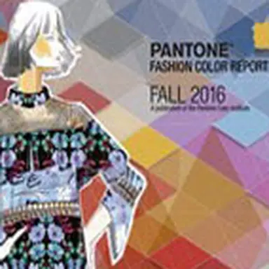
Inspired by consumers’ continued search for reassurance and stability, fashion designers seek to answer a common call for calm through a Fall 2016 colour palette that captures strength and dependability while remaining uplifting, complex and sophisticated. Satisfying a universal desire for tranquillity, strength and optimism, as demonstrated by the Pantone Colour of the Year 2016, colour directions continue to evolve toward an antidote to modern stresses for both designers and wearers.

A Unity of Strength, Confidence and Complexity
‘ If you look at this season’s entire palette, the idea of comforting Blues coming to the top of the list again shows that people are still searching for that reassurance ,’ said Leatrice Eiseman, executive director of the Pantone Color Institute. ‘ The colour Blue is fundamentally important to the human eye as a stable icon of the balance in our universe. Even in an uncertain world where cultural, economical and social tensions can cause us anxiety, we remember that the Blue skies represent constancy – they have never fallen. The Greys give a feeling of stability and represent rock solid colours that you can go back to and use with everything in your wardrobe. The Red tones invite confidence and warmth while the hot Pinkish Purples and Spicy Mustard Yellows suggest a touch of the exotic, rounding out a palette that is stable and grounded but also bold and complex.’
About the Fall 2016 palette
The Blue family leads the Fall 2016 collections in the form of
Riverside
, a cool and calming hue with a subtle sophistication, and
Airy Blue
, a nod to one half of the Pantone Colour of the Year 2016, Serenity, that evokes a feeling of weightlessness. The complement of strong and light Blues at the forefront of designers’ work gives wearers a much-desired feeling of repose as an independent pairing, or suggests freshness when combined with hues Lush Meadow, Taupe or Dusty Cedar.
 Another anchor to the collections this fall is
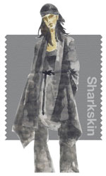
Sharkskin
, which serves as a neutral with an edge. Pair-able with almost any fall colour whether bright or muted, Sharkskin is a colour that the rest of the palette can literally and theoretically rest on. While several Greys have come through the fall collections, this particular shade showcases practicality through a dependable but contemporary lens.
In contrast to the stability that serves as the backbone of the Fall 2016 palette,
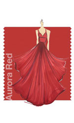
Aurora Red
adds a welcome punch. A bold Red that is warm and sensual, Aurora Red gets the metaphorical blood of the palette and the collections pumping, in a way that breeds unmistakable confidence. Also conveying warmth, but more mildly, is
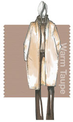
Warm Taupe
, a hearty, grounded and approachable neutral that harkens back to our search for reassurance and stability, and pairs well with each of the top 10 shades of the Fall 2016 season.
A fall and winter version of the Pinks we’re used to seeing in spring,
Dusty Cedar
is a dustier rose-toned Pink shade with some complexity that nods to the other half of the Pantone Colour of the Year 2016, Rose Quartz.
 Lush Meadow
, as its name suggests, brings to mind fresh botanicals and foliage. Rich and elegant, vibrant and sophisticated, this Green shade displays a brightness, panache and depth of colour that elevates the overall elegance woven through this season’s collections.
 In a shift from previous seasons, the spicier, zestier Yellows we are seeing for Fall 2016 are exemplified through
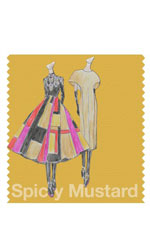
Spicy Mustard
, an unexpected and unusual but welcome addition. Bouncing elegantly off other colours in the palette and adding another splash of uplifting vibrancy, Spicy Mustard is an exotic addition that comes through in both the abstract and the more defined geometric accents designers have employed this season. Another neutral earth tone,
Potter’s Clay
takes the palette back to what we might expect for fall and winter fashions, but like Spicy Mustard, Potter’s Clay has an added degree of sophistication and inherent layering. This warm orange-toned shade has emerged as another strong foundation for the fall palette.
Lending itself to fabulously interesting and vibrant colour combinations,
Bodacious
speaks to the gender fluidity we’ve come to see with designers’ use of colour. Surprising for the fall palette, this versatile Purple shade can be used monochromatically with colours in the Pink and Red family, or just as easily with Spicy Mustard or Potter’s Clay. The bright, rich Purple, with its hints of a more sophisticated Pink, transforms fashion accents into fashion statements.
Source: Beautypress.com

